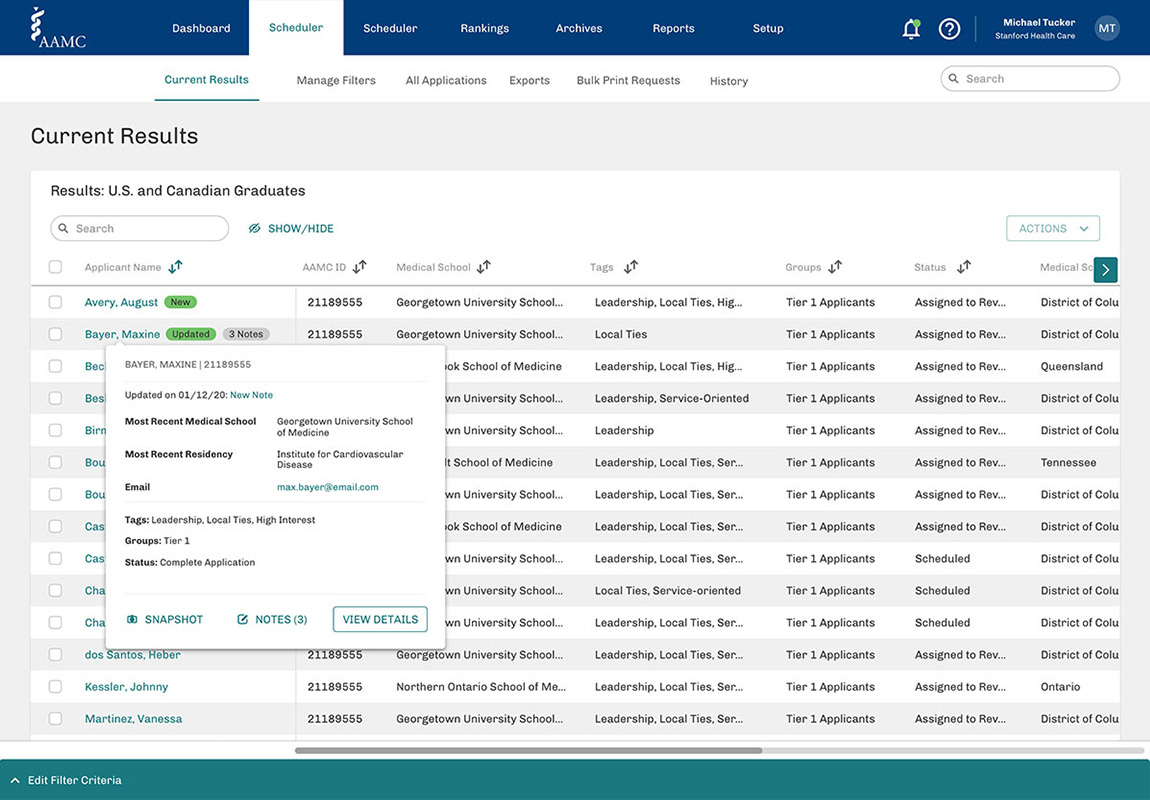
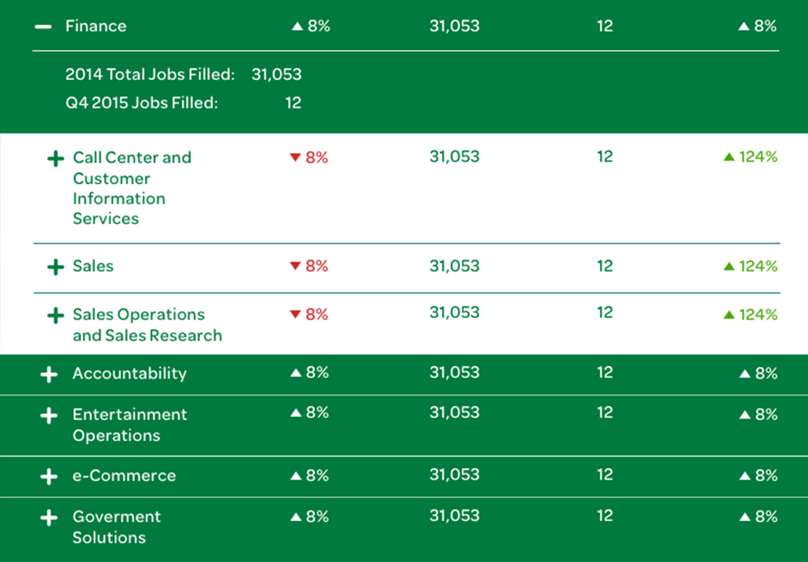
When medical students apply to residency programs, programs must review and manage hundreds of applications. I helped redesign the online tool for application management, which is provided by the Association of American Medical Colleges (AAMC). Our team reviewed user interviews to identify the main pain points of the old tool and develop a better UX for sorting and filtering applications all the way through ranking top applicants for “the Match.”
View the projectHello! I’m a versatile storyteller, pragmatic leader and digital creative director. I’m comfortable with big brands and demanding deadlines, and have a passion for building collaborative relationships with clients and colleagues.
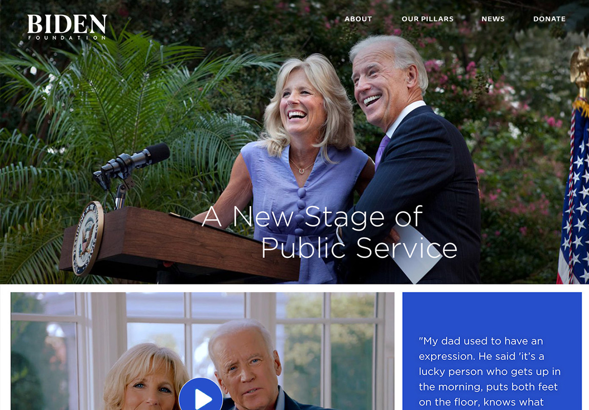
Long before he became Vice President, Joe Biden’s life was about public service. In this next phase, the Biden Foundation will continue that legacy. I designed a custom website on WordPress to empower the Foundation to communicate this exciting initiative and galvanize support among key donors and the public.
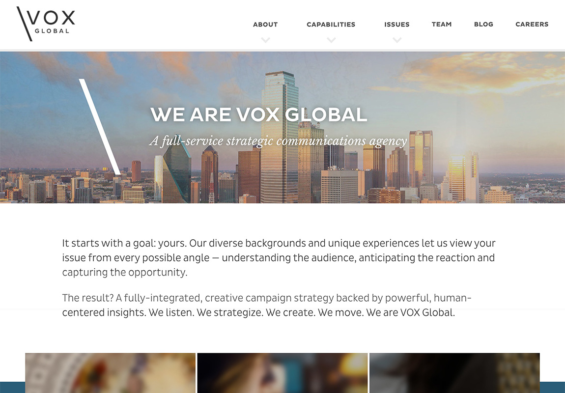
View the projectWhile at VOX Global, I led the redesign of our brand in 2015, crafting a future-forward logo, visual identity and tone of voice for the evolving communications agency. In 2019, I redesigned the home page as well as key sub pages.
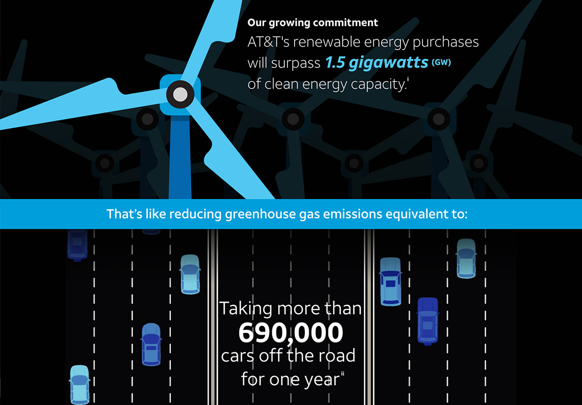
View the projectWhen AT&T made a major commitment to renewable energy, I oversaw the production of a central animated infographic and associated social media graphics to convey the excitement of the announcement.
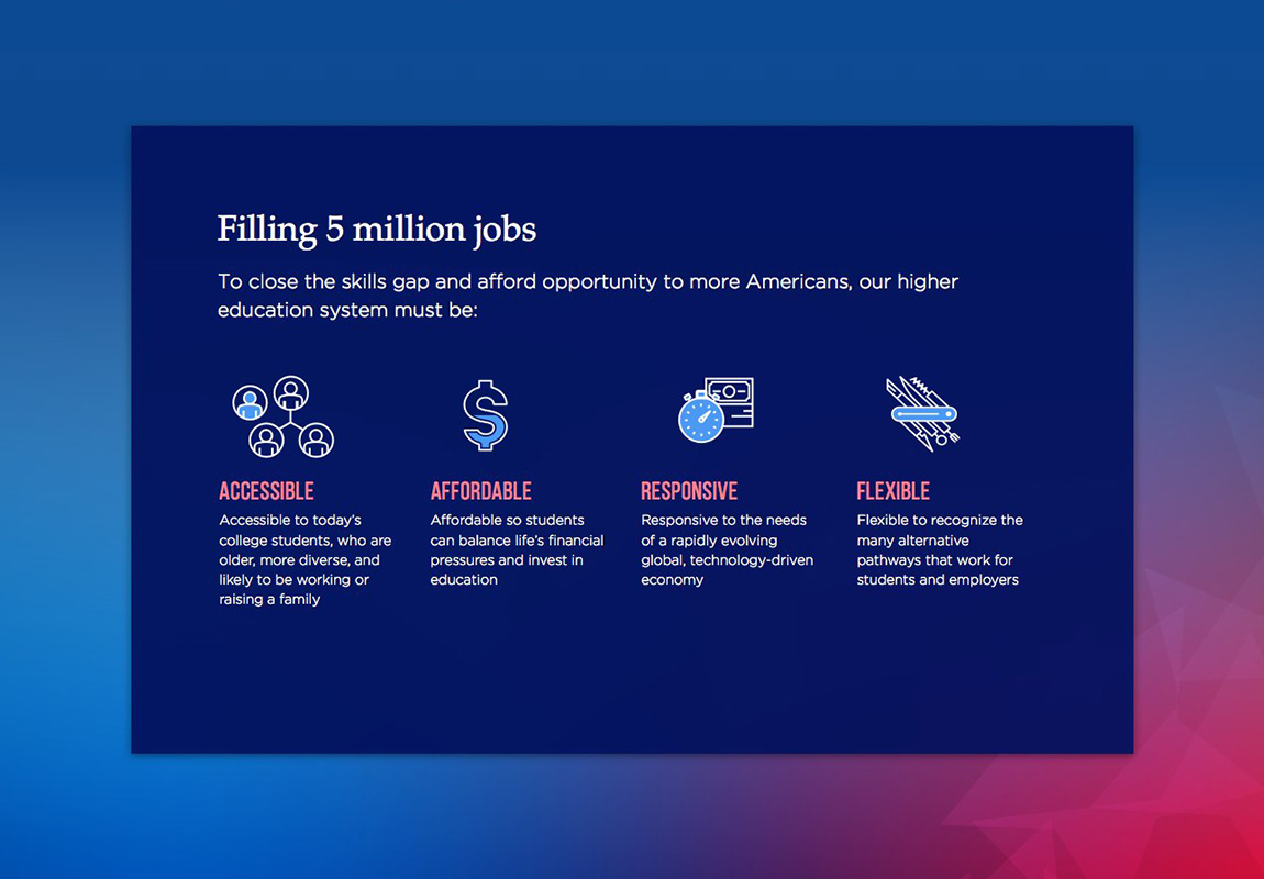
View the projectWe were engaged by the Lumina Foundation to create a concept for a large-scale national outreach campaign. I led a team in coming up with three distinct concepts for the central website.
View the projectIn a large organization like AT&T, employees have many opportunities to change careers while remaining at the company. My team was hired to help concept and design an app that would help employees access information that could inform their decision-making.
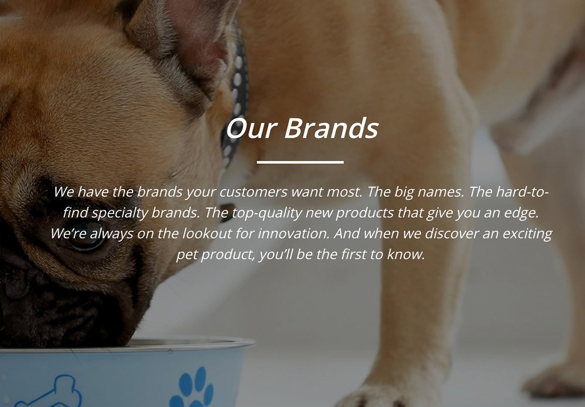
View the projectAnimal Supply Company, a B2B pet food distributor, needed a new way to tell their story. I led content development for the company’s new website and reviewed social media channels to incorporate an updated tone, voice and message framework.
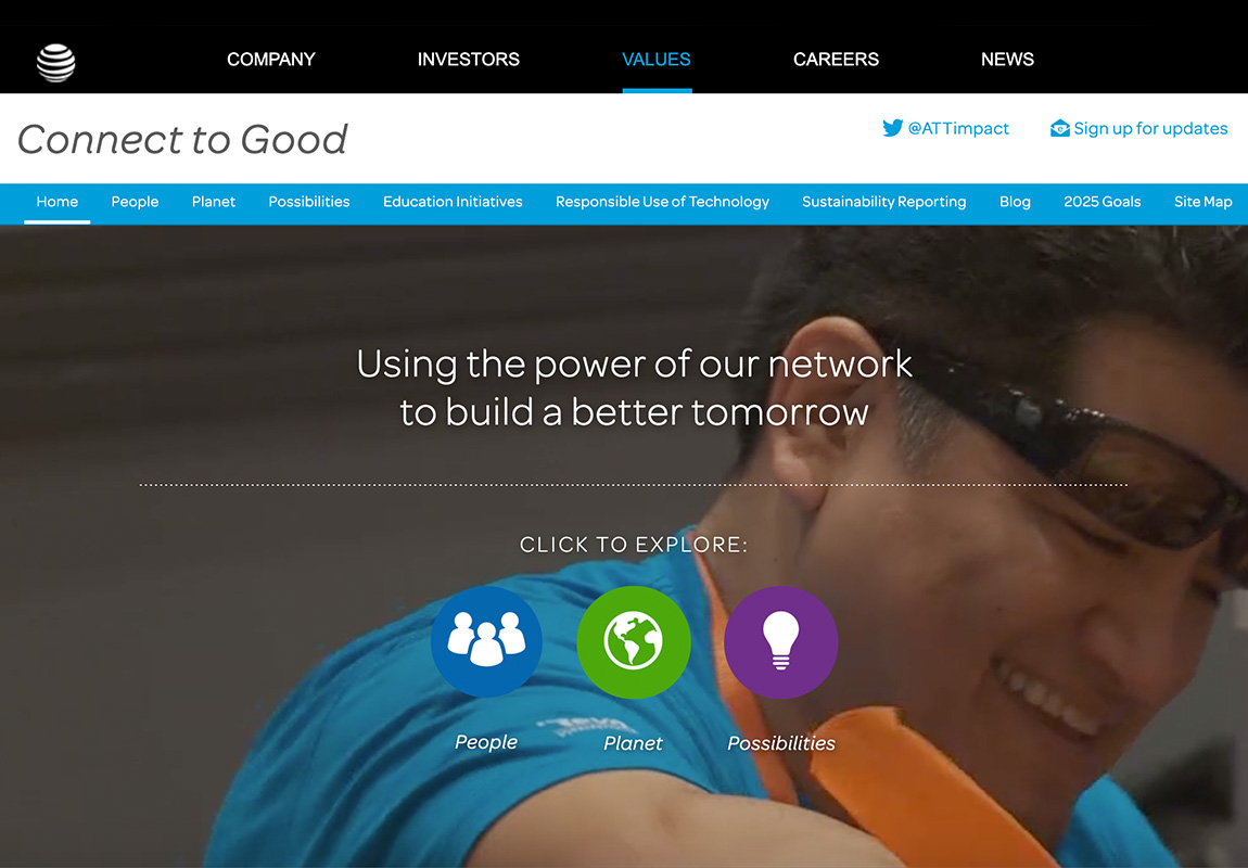
View the projectIn a re-architecture and redesign of the AT&T Corporate Social Responsibility website, the client’s main goal was to tell the full story of AT&T’s CSR work. I led the process of mapping out the new content architecture and designing flexible page templates for Adobe Experience Manager.
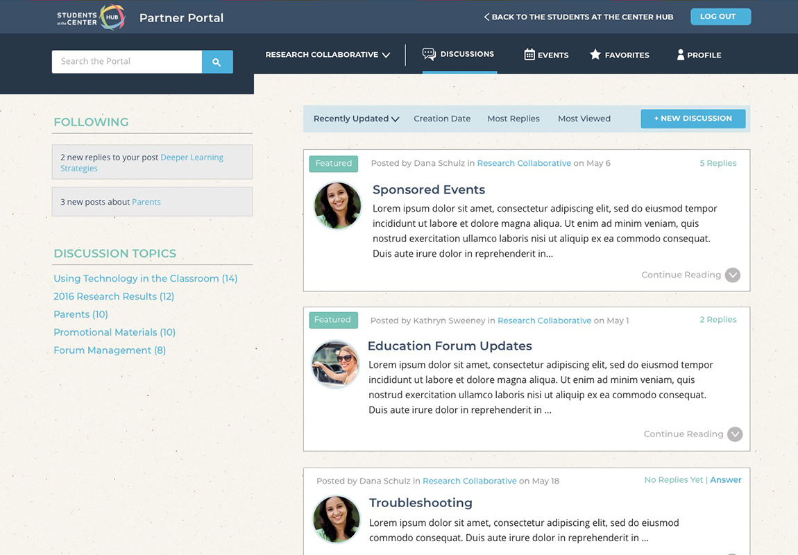
View the projectThis members-only portal, built as a new feature on top of an existing public WordPress site, allowed members to request to join one or multiple groups where they could communicate via forums moderated by group leaders. Additionally, group leaders could publish pages within their group, and all members could add events to a shared group calendar, manage their individual profiles and “favorite” resources from the main, non-password protected site.
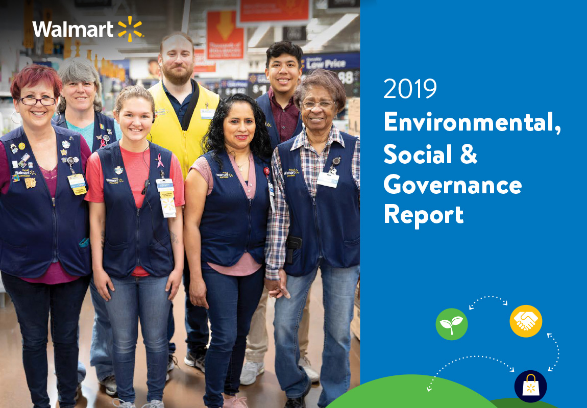
View the projectTo go along with a new report format, which had a target audience of investors, Walmart wanted a fresh, streamlined look that would still be in-line with their family-friendly brand.
View the projectI worked with a team of motion designers and video editors on the creation of quick-turn social assets to support AT&T’s environmental sustainability efforts.
View the projectIndiana University Research had a bold idea: strategically invest research into “grand challenges” — large-scale problems facing humanity and the world. When my team was enlisted to promote the announcement of their second Grand Challenge, I led creative for digital outreach.
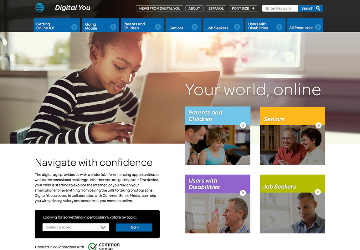
View the projectThrough Digital You, AT&T promotes digital literacy to communities at risk of falling behind in the digital age. I designed a custom website on Wordpress to help Digital You distribute key resources to members of these communities.
View the project